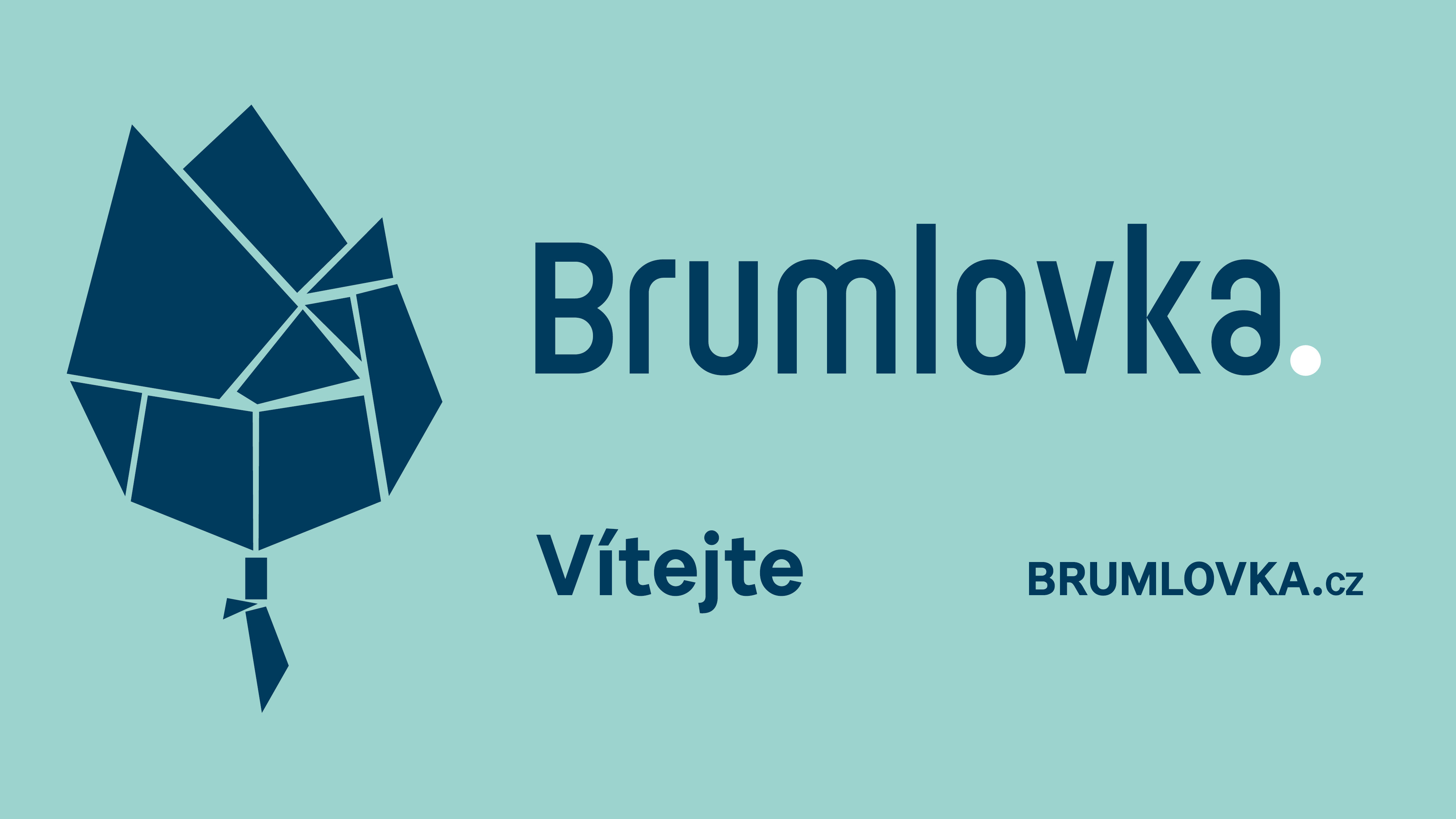
Brumlovka. Welcome! We present a new visual identity.
Passerinvest Group is behind the urban transformation of this locality, which is one of the largest projects of its kind in Europe. Through the development of the entire area, Brumlovka has become a full-fledged city neighbourhood and the original name of the BB Centrum office complex has been surpassed over time. Thus, through natural development, in April 2022 the local designation of Brumlovka has newly returned for the locality, though for many it has always been used.
Brumlovka. Welcome.
“The decision to change the name did not happen overnight. We have been working on this idea in the company for several years. We have seen the feedback from locals and the people who work here as part of our day-to-day activities. Roughly a year ago, we conducted a larger survey among the residents of Prague, in which the name Brumlovka resonated much more significantly and naturally, although the name BB Centrum was quite well known to the general public. However, even in the context of our company's strategy, which has long been concerned with the sustainable development of the area, the change of name to Brumlovka was ultimately a clear choice. From the spring of this year, the change of logo and new graphic identity will be visible right on site, and we will moreover be supporting it with a communication campaign both online and in the press and outdoors,” explained Kristýna Samková, Head of Marketing and PR, Passerinvest Group, a.s.
Brand Mission: Brumlovka is a good neighbourhood in which to work and live
The change of the name also brings a new graphic form of the brand. The greenish colour indicates purity, greenery, and positive communication and the dark blue colour underscores trust, safety, humanity, stability and long-term sustainability. The new brand thus contains its mission and supports the values of this locality.
Brumlovka is green, Passerinvest blue
"Hand in hand with the change to the location of Brumlovka, the logo of the entire Passerinvest Group was modernised and a new communication identity was set up for it. “In general, the original logo and all corporate materials currently used by the company have been simplified. The newly chosen dark blue colour accentuates the values such as fairness, humanity, patriotism, trust and responsibility that our company has been holding and communicating for a long time,” added Kristýna Samková.
The full press releas is available at passerinvest.cz
Marketing team, Passerinvest Group, a.s.
All News